This is a summary of a presentation I attended at the virtual Canadian Association of Nephrology Dietitian Conference in June of 2024.
Presented by Kelly Lambert, PhD AdvAPD
What makes health literacy skills challenging in the CKD population?
CKD often occurs concomitantly with cognitive impairment and depression. This can make it harder for patients to understand what they need to do to:
- Manage their health
- Change their lifestyle to improve their health
- Find the energy to manage their health.
How common is cognitive impairment in CKD?
- 62.5% Stage 4 CKD
- 53.2% dialysis
- 19.2% transplant
This can not always be apparent in standard clinical interactions.
What cognitive skills can be more challenging?
- Executive functioning: self-monitoring and ability to make and sustain change
- Visuospatial skills: can be hard to understand information on a written page
- Decreased attention.
- Language: impaired retention of auditory information and difficulty following multistep instructions.
What is the difference between food and nutrition literacy?
Food literacy is the knowledge that people need to eat and plan meals. The four elements of food literacy are:
- Planning and managing
- Selection of food
- Preparation food
- Eat food
Nutrition literacy is the ability to apply all 4 steps of food literacy in a comprehensive way.
What strategies can be used to improve nutrition literacy at the patient provider and health system level?
- At the patient provider level: Use check and teach back methods – dietitians are over confident in their ability to do this.
- At the health system – use of plan language and the use of clear and well-designed health education materials.
What tools can we use to support more patient-centered communications?
Renal diet question prompt sheet. Initially developed in oncology to help guide a health care visit. This can help patients figure out what questions to ask.
In a study, patients appeared to really enjoy these tools based on the high amounts of fill in rate. It also increased the amount of patient centered care and the amount of time spent delivering nutrition education and counselling, as opposed to the majority of the time spent doing nutrition assessment.
How can clear communication techniques impact outcomes?
Examples: The HERALD study – changed for elements to plain language communication, QPS, teach back and redesigned diet sheets.
Patient’s received the question prompt sheet in advance. In the pilot, the percent of no shows decreased, significant improvements in fruit and vegetable intake, improvements in quality of life, improved satisfaction with service.
How is the health literacy of renal diet information available online?
- Quality of online materials is highly variable
- Grade reading level was too high (aim is for Grades 6-8)
Recommended tools: The Hemmingway Website is a free online tool that you can cut and paste information into and gives feedback.
- Ensure that all information provides at least one item that some one can do/take away.
What do dietitians need to think about to write in plain language and design diet sheets?
Common mistakes:
- Uses consume instead of eat
- Uses dietitian speak (e.g. protein foods, fuel up, energy, serve, intake, requirements) >> patients hate these terms.
- Uses vague terms (e.g. moderate, occasionally, sometimes, avoid, plenty) >> patients want specific information not these terms
- Talk nutrients not food (e.g. “Most people who have kidney disease need to limit salt (sodium) fluids and protein.”)
- Written in passive voice >> Use active voice. Include the words “You could…” or “You can…”. This makes it feel more personalized.
Only about 40% of patient handouts tell people how to make use of information. Many handouts leave too much unsaid or they can’t stand alone. Patients like getting handouts as it helps them remember but if it doesn’t tell them what to do then it is waste of paper.
What tools can help use create better patient handouts?
Two websites were recommended:
What are common layout problems in diet sheets?
- Purpose of the sheet is not clear: Make a statement of: “This diet sheet is for people who need to…”. Make sure people know if this is for them or not.
- Sheet does not provide a summary: give a summary of the key take away points
- Figures are not used properly: they should be labelled so people understand what it is there. Figures shouldn’t be used just for decoration.
- There are generational differences in layout preferences. Older generations prefer columns: The key element of columns is that it gives more white space and helps to chunk information. Younger generations tend not to like columns – perhaps because they are more likely to look at things on their phone.
What are important design features in diet handouts?
- Clear title
- Chunk and sign post (e.g. sub-headings).
- Make the subheadings a question
- If there is a meal plan – leave space to make notes
- The final box should be a summary box of the key points
- Consumers like a footer on document that includes a date and information about who developed it
- Perfect amount of bullet points – 6-9 examples of foods provided in a list.
Patient handouts that use steps – was considered highly valuable by consumers. If you want people to learn to read a food label, give more details.
Consider abstract concepts – An example:
Eg. If we restrict coca-cola, do they understand that we also mean pepsi? The evidence suggests not all patients will understand this.
Why cognitive load theory matters?
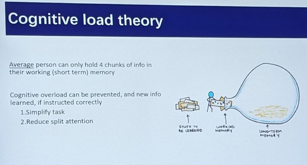
- The average person can hold 4 pieces of information in their short-term/working memory.
If you want information to move from short term to long term memory. The best way is to attach the new information to old information. E.g.
- Step 1: Have you seen a diabetes dietitian before?
- Step 2: If yes – what did they say?
- Step 3: Explicitly connect the information (can say either it’s the same or different).
Examples of handouts that aren’t good?
- If the figures themselves aren’t labelling people don’t know that they are looking at.
- Uses vague terms – e.g. diet foods (people don’t know what this is)
- Colour Sheets – will it be printed in black and white or colour? If black and white, design it that way.
- Too much information can make it overwhelming.
- People do not automatically know that the circle diagram means a plate
- Handouts that too busy are also not liked.
- Put the most important information up front
Do people prefer real images or cartoons?
- Either or – but be consistent
- If you are printing in black and white, ensure that the images will print OK. People dislike not being able to make out a black and white sheet that was meant to be in colour.
Information in the right hand column is often felt to be less important.
Any information on translated materials?
- When materials are translated by computers vs humans people can tell.
- English second language consumers – will often have a family member make a half page summary sheet of our English Handouts.
When is the best time provide the handout?
- Either during or after.
- People don’t like getting handouts outside of context
- Low potassium diet handouts that are sent out without being reviewed by the care provider can make it hard to put that information into context.
Should we have materials for various levels of health literacy?
- Yes! Ideally we need handouts for people with high health literacy and low literacy.
What should we do when people have a huge collection of previous diet sheets and information?
- People would prefer to have a comprehensive diet recommendations. They don’t like it when there is contradictory information. The dislike for example have a diabetes handout and a renal handout, especially if it conflicts.
My biggest take away:
I need to try that patient question prompt sheet (which is why I have added it as a resource to my webpage!)
