In 2019 I wrote an article on potassium bioavailability. Recently, I was asked to create a patient resource summarizing the article. It’s been on my to do list for a little while now and so I figured it was time that I carve out some time to make it happen.
Fortunately, I recently watched a webinar hosted by the International Society of Renal Nutrition and Metabolism and one of the speakers was Dr. Kelly Lambert. In Dr. Lambert’s section she was talking about key ways we can make patient education resources better and it gave me good food for thought.
I decided to go a little more in-depth and found that Dr. Lambert recently published an article in the Journal of Renal Nutrition on designing patient education materials for people with CKD. So that is the topic of today’s journal club!
Why did Dr. Lambert write this article?
Adults living with CKD find dietary advice confusing, overwhelming and burdensome. Furthermore, 1 in 4 adults living with CKD have low health literacy.
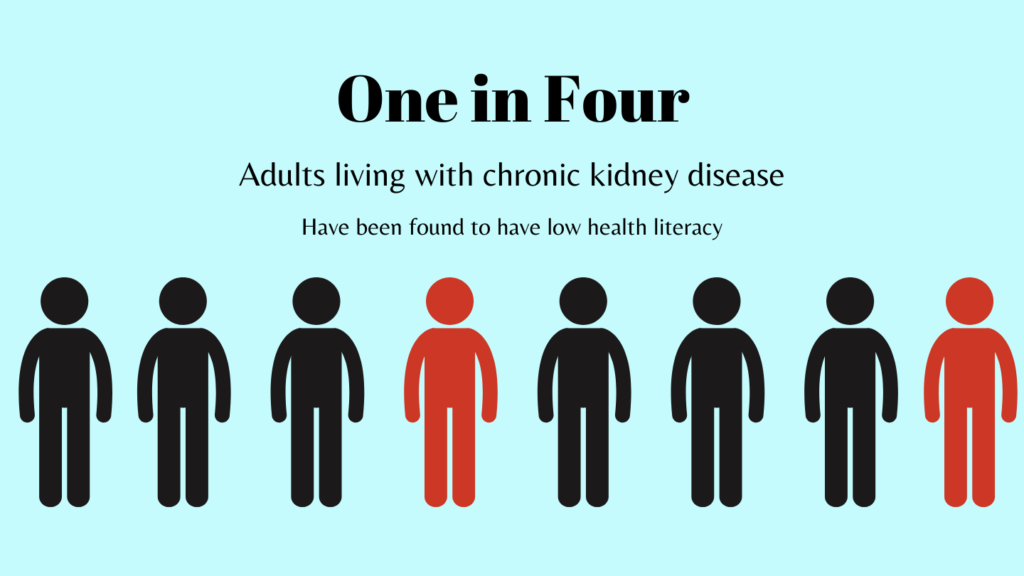
Therefore, the goal of this article was to evaluate the patient education materials published by the Journal of Renal Nutrition between 2011-2021.
How did they do it?
The Journal of Renal Nutrition’s patient education resources were downloaded. Content was graded on:
- Readability using Hemingway editor (https://hemingwayapp.com/). This app provides a grade reading level. The goal was to have scores below 8, though acknowledges that the average American reading level is grade 5.
- Understandability and actionability using the Patient Education Materials Assessment Tool (PEMAT). Understandability means that users understand the material. Actionability means that they understand what to do based on the material. This tool generates a score between 0-100, with higher scores being better scores. Dr. Lambert used a scoring cut of 70 and over to determine acceptibility.
- Quality assessments used the CDC Clear Communication Index. This index assesses the main message, language, information design and behavioral recommendations. An ideal score is 90% or higher.
What did they find?
42 patient education materials were evaluated. The median grade reading level was 5, and 92% were below 8. Good work education creators!
The median understandability score was 71%, which meant that only half met the benchmark score. Or put another way, half did not provide information in an understandable way.
The median actionability score was 37%, which meant that only 1 in 4 met the benchmark score. Or put another way, 3 in 4 did not provide information in an actionable way. Patients want to know what to DO after reading the material – so we need to make this our goal when we create handouts.
The quality score was low at 65%, with only 10% meeting the benchmark score.
What can we take away?
The article provides a really good table in the discussion on recommendations to improve kidney diet patient education materials. Check out the full table next time you are creating a patient handout!
For me here are my top 10 actionable take aways:
- Use a readability calculator. Aim for a score around 5.
- Use short sentence, ~25 words
- Chunk information, use subheadings with questions
- Define what the handout is for e.g. This handout is for people who need….
- Limit the key messages to 3
- Clearly state the action you want the reader to take
- Explain why action is needed
- Use wide margins and leave white space between sections
- Use font size of 12-14 in Arial, Helvetica, Futura, Calibri
- Use captions on all visuals
Thank you Dr. Lambert for putting this list together for us. Now I had better get busy and create that handout!
